GAME Website Re-Design
PROJECT OVERVIEW:
Project Duration
25 June 2024 - 30 June 2024
My Role
UX Designer:
UX Research
User Interface
Visual Design
Tools used
Project Goal
Enhance the existing shopping experience of GAME by revamping the homepage and shopping cart for improved optimisation.
Solution
Research
Ideate
Design
Learn
Notable Insights from competitor research
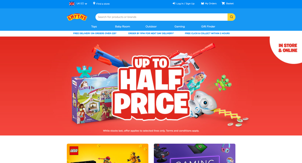
I explored the homepages of GAME’s main competitors: Smyths, HMV and Argos. I gauged the general layout and alternative factors typography, images, padding, white space and iconography
Comparisons were made with between GAME’s main competitors and how their homepages faired.
Smyths Toys employs a straightforward homepage design that maintains brand-consistent colours across the entire page. The homepage predominantly features images with minimal textual content, ensuring a visually impaired-friendly experience. Furthermore, the well-considered spacing between elements contributes to a user-friendly interface.
One noticeable aspect is the absence of a distinct focal point, which can impact the overall consistency of the page.
An interesting design choice is the use of rounded corners for buttons and cards, a departure from the common practice among gaming and toy retailers. This unique feature adds a modern touch to the design, making it stand out in a positive way.
The HMV homepage seems to display a congested crowded interface, characterised by a substantial volume of images and text. This density may prove overwhelming, particularly for users who are less tech-savvy or have visual impairments.
The saturation of text, banners, and images can make it challenging for users to process the homepage's content. This serves as a clear illustration of the difficulties involved when a retailer expands its product range beyond games for example, making it intricate to effectively showcase all available products on the homepage.
Argos's homepage boasts a well-structured layout, delivering an enjoyable and user-friendly interface. Like HMV, the page can appear somewhat cluttered, which can be attributed to Argos's extensive product range. This design approach serves users who may not be tech-savvy or who have visual impairments. However, the use of multiple colours on the homepage may not perfectly align with Argos's established brand identity.
Argos excels in presenting a diverse array of products on the homepage without overwhelming visitors. This hinders the brand's capacity to showcase a wide range of items in an orderly and easily navigable way.
THE REDESIGN
Original Navigation Bar
VS
Navigation Bar After Redesign
I thought long and hard about how much information to put in the website's navigation bar. The original one was quite cluttered, so I decided to simplify it, creating a cleaner and more professional look.
The 'sign in' part of the menu was redesigned, replacing it with a clear call-to-action button that matches the brand identity.
Regarding the brand identity, GAME has always been distinctive because of its unique branding and colour. However, the current navigation bar uses a dark grey colour instead of the signature burgundy. In the new design, I considered the brand identity and what the stakeholders are familiar with, aligning it with the high street stores that use burgundy. This change ensures that the online and in-store customer experience is consistent.
NOW THAT’S A BASKET!!
Say goodbye to the days of an outdated and unprofessional appearance! The shopping basket was given a sleek revamp, eliminating those sharp corners and optimising the spacing.
The result? A fresh, modern look that screams 'up-to-date' and promises a delightful user experience
Original Basket
VS
Basket After Redesign
Gone is the 'View Basket' button, streamlining the checkout process. Now, users can swiftly proceed to purchase their desired items without the extra step. Not to worry about missing out on details – I have strategically placed the option so that users can view the basket at the checkout stage.
The enhanced visibility of the basket serves a purpose. It will assist individuals with visual impairments by providing a clear view of items in their basket, making the checkout process a breeze. The goal? To make shopping with GAME not only visually pleasing but also efficient and accessible for everyone.
Constraints
Due to limitations in time and resources, obtaining extensive primary research and data was not possible. As a result, I heavily relied on secondary research sources and prioritised the application of user experience design principles to enhance the online homepage experience for GAME.
The Experience
To improve user experience and reduce fatigue, I have implemented changes such as increasing padding and limiting the number of cards to six. This not only gives a more polished and professional look to the homepage but also provides ample breathing space.
Furthermore, the cards have been edited to evoke a puzzle-like sensation, symbolising the harmonious assembly of elements in a game. This cohesive design not only contributes to the overall aesthetics but also enhances the user's experience, offering a distinctive and engaging interface.
Users can now scroll without feeling overwhelmed, and exploring specific product categories can be done incrementally, maintaining a focused display on each page
Original Website Homepage
VS
Original Website Homepage
TAKEAWAYS:
While deviating from the original structure, I enhanced the interface layout to exude professionalism without undergoing a complete overhaul. The new design gives the interface more space to breathe. This should make users happy and help them navigate more smoothly for an overall better experience. Since the homepage is the first thing users see, it's important to keep them interested.
The re-design focused heavily on specific contexts. Exploring a more holistic approach would be intriguing, considering all aspects and webpages within Game UK's online ecosystem that impact both the homepage and online shopping basket.
Testing the new homepage interface through methods like A/B testing or even guerrilla testing with users which would be ideal. Gathering insights through this process is crucial for refining and would ease and focus any future design decisions.
Given the limitations I faced when it came to design decisions, having access to GAME's online user data would enable to make more informed design decisions, optimising the overall user experience.


